ink notebook logo, orange octopus

Activated by collaboration, ownership, and reflection, INK is a digital notebook app designed for students in collaboration with the Monterey Bay Aquarium.

OVERVIEW

Our team’s goal was to leverage user-centered design to deliver a prototype of a digital notebook app. During this 6 month effort, our team exceeded our client’s expectations as we provided hand-off documentation and investor pitch materials to support engaging donors to fund development and deployment to make INK into a working app.

I was one of two primary researchers leading foundational research such as observation, interviews, focus groups as well as usability testing through multiple iterations.

Software used
  • Figma: prototypes, develop scenarios to support usability testing
  • Google suite: documentation, presentations, spreadsheets; organization and access
  • Optimal Workshop: card sort and analysis
  • Asana: project management, task management
  • Slack: team communication, regular meetings with clients and other stakeholders

the team

  • John Molendyk - Research
  • Clara Huang - Research
  • Youngsun You - Design
  • Alex Duong - Design
  • Serena Epstein - Product Management / Design

Brought together through the Master of Human-Computer Interaction & Design (MHCID) program at UCI, our team consisted of product management, research, design and development professionals from various industries including education, technology and consulting.

MY CONTRIBUTION

As one of two primary user experience researchers on the INK project, I co-lead research and actively collaborated on all design activities..

  • Strategy and Planning
  • Client and User Interviews
  • Focus Groups
  • Ideation Activities
  • Design Revisions
  • User Testing
  • Findings Presentations
  • Design Recommendations
  • Documentation - Ink Notebook Interaction Documentation

client

Monterey Bay Aquarium (MBA)

Monterey Bay Aquarium is a world-renowned institution dedicated to inspiring conservation of the ocean. Since opening in 1984, the Aquarium has become a destination for millions of visitors while becoming a leader and educator in ocean conservation.

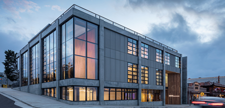
With the opening of the Bechtel Education Center in 2019, STEM education is a clear focus of the Aquarium’s future. The new Center is a space for learning that is geared towards supporting students and teachers with innovation and learning opportunities both in the lab and out at the tidepools.

Loaded with wide open workspaces, cubbies for collaboration and a center created to showcase technologies normally hidden away, the Bechtel Education Center was completed in 2018. The center gives students a place to learn about ocean conservation while developing skills in the scientific research process.

Monterey Bay Aquarium Website

The Bechtel Center in Monterey Bay, CA
Bechtel Family Center for Ocean Education & Leadership

users

  • Primary: 6th - 12th graders part of MBA education programs
  • Secondary: Teachers and staff members

While our focus was on student’s in the MBA’s education programs, in collaboration with our client, our team set forth to design an app that could be used to support various subjects from any discipline that could benefit from a digital notebook designed specifically for education.

Because the students and teachers were already participants in the MBA education programs, our project was able to recruit using the prior authorization releases provided by the parents of students who participated in the learning programs. Thsi allowed our team to focus our efforts, allowing us to make rapid progress in all areas of our effort.

users in action; students and instructors from the MBA education programs in the tide pools
Students and instructors from the MBA education programs in the tidepools

problem / client requirements

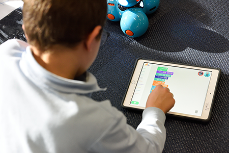
As a student in an education program at Monterey Bay Aquarium, learning happens in the lab, at the tidepools and back in their regular classrooms. With no single app representing a complete solution, students use a variety of apps, paper worksheets and non-digital tools while working on assignments, causing inefficiencies that could be resolved with a single app-based solution.

Challenges we Discovered
  • Physically transporting dozens of paper-based notebooks by teachers for feedback and grading was difficult and caused delays to timely feedback.
  • Converting physical / paper materials to online formats was time-consuming and limited sharing and collaboration opportunities.
  • Referencing (Reflecting) past observations and insights is difficult due to the physical limitations around storage and on-demand access.
  • Inequity due to inconsistent access to technology and wi-fi by students outside of the classroom.
  • Multiple technology platforms means more work for teachers who need to learn platforms to support students.
Client Requirements

Upon engagement, our team received requirements developed by MBA education staff. While the requirements were well-informed from their experience, our client was also interested in what our user-centered process would reveal. This allowed the team to move forward with guidance, but few constraints on where our process might take us.

Some of the requirements were

  • Content creation (typing, drawing, writing, photos, videos, audio)
  • Access anywhere (classroom, home, field)
  • Organization to support reflection and reference
  • Feedback & assessment (teachers & peers)
  • Language recognition / translation
  • Data collection tools using sensors (measure)
  • Data visualization tools (charts / graphs)

"Reflecting on previous insights is difficult due to physical limitations around storage and the need for on-demand access."

PROCESS

Iterative, User-centered Methodology

Our design methodology was a user-centered process starting with a focus on understanding the user through research methods.

As we move forward through the process of defining the user and designing potential solutions, we get direction again from the user and stakeholders through feedback and results of iterative usability studies.

Our process finalizes with deliverables to support the client's needs to pitch the project to donors in addition to design documentation to support future development.

Our Phases
  • Understanding our User
  • Defining Needs
  • Designing Solutions
  • Testing with Users
  • Iterating as Needed

1 existing apps

Notability was the primary notebook app used by our client as part of the education programs. Researching other apps helped us understand the current landscape of apps and what users liked and didn't like, as well as some information on user goals.

We reviewed Notability, Evernote, OneNote, Google Science Journal and Zoho Notebook.

Notability digital notebook app with a drawing of a bicycle hanger design
Notability digital notebook app with a drawing
positive feedback
  • content creation
  • organization
  • search
  • collaboration
  • personalization
  • data collection
user challenges
  • technical issues
  • lack of support for switching between devices
  • export and sharing
  • mixing media types within content
  • Some content created not searchable
  • Lack of flexibility in tools

2 literature review

We reviewed existing literature and previous studies around notebooks, technology and tools in the classroom and designing for students.

TOPICS FOR REVIEW
  • Notebooks in science and learning
  • Students and technology
  • Designing for teens
  • Performing mixed methods research with teens
KEY INSIGHTS
  • Handwriting personalizes notebooks and increases a sense of ownership.
  • Archiving of notebooks allows for reflection increasing the chances the user will gain insights from previous research.
  • Inequities occur due to a lack of support and training for teachers when technology is implemented.
  • Gamification can help motivate users once natural motivational needs are met.

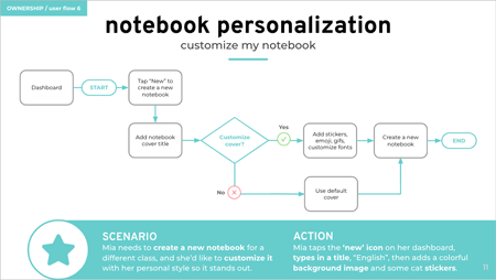
"Personalization transforms the notebook USER into a notebook OWNER"

3 field observations

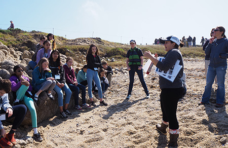
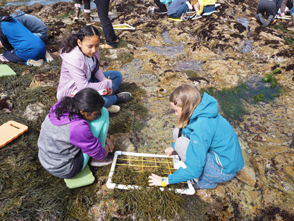
Our first observation was students collecting data at the tide pools. We noted students working in small groups, each with a specific role, but collaboratively gathering data, taking notes and completing tasks on paper worksheets. We left with observations around collecting data, taking notes and group collaboration.

We also collected examples of completed paper-based worksheets that students used to collect data along with identification of several specific models of data collection, such as quadrants.

Key Insights
  • Students share responsibilities within a team. One student generally takes notes for the team.
  • Student roles are fluid and may differ from assignment to assignment.
  • All students should be able to share and access notes later.
  • Students had varied attention spans and there was a social component to how most groups completed the assignment.
  • Teachers provide some structure and guidance, but are mostly there to oversee group activities and answer questions.
  • Students are given guidelines and taught data collection methods before entering the field.
  • Teachers provide worksheets, and students follow a given format.
  • Students create their own experiments and are able to determine how to collect data and what format it will take later (graphs, lists, drawings, etc.).
Students from the education program working in the tidepools

"Students create their own experiments, defining questions, collecting data and presenting findings with charts, graphs and presentations."

4 interviews / focus groups

The team held multiple interviews with teachers and education center staff who defined how technology was supported and the challenges they experienced. As the creator of programs who also directly supports students, the information the staff shared provided the team with an understanding of what was working and where technology could better support their mission.

Details / Methods
  • 7 Interviews
  • 1 Focus group
  • In-person and remote
  • Mix of structured and semi-structured
Key Insights
Collaboration
  • Peer and teacher feedback are critical to the learning process; but younger peers may need help with what feedback looks like.
  • Students respond best to descriptive feedback rather than grades, but descriptive feedback takes more time for teachers as descriptive feedback should be specific and actionable.
  • Different types of feedback should be used based on relationships among peers/teachers.
Organization
  • Students are most successful when given the freedom to set up and organize their own notebooks.
Reflection
  • Students are encouraged to tell a story with data and insights.
Content Creation
  • It’s not enough to digitize paper assignments; the more interactive, pictures, colors, rich descriptions, the better.
  • Integration of a variety of digital tools and utilities facilitate higher equity among students.
  • Talking, taking pictures, video and drawing are important tools for some kids who aren’t ready to type.
Platform Independence
  • There is a higher availability to work on projects at home and school due to digital access.
  • Teachers and staff can see real-time if students are understanding a concept and can intervene if needed.
  • Teachers with an understanding of technology are getting higher engagement from students while finding the time to give feedback and grading to be less than traditional assignments using paper-based methods.
"Students who use technology are more engaged"
TEACHER
"Students are most successful when given the freedom to organize their own notebooks"
TEACHER

5 card sort

Our research up this point identified the functionality needed in the app, so we used a card sort to understand the priority and importance of these things from a user's perspective.

Details
  • Participants: 49 students and 36 teachers
  • Method: closed sort; sorting importance on 19 topics, remote, unmoderated
card sort results under analysis using a spreadsheet
Results from the card sort being analyzed by research
Lessons Learned
  • Our own research, in addition to the research from our client indicated that personalization is important to students. However when asked to rate the importance of personalization, students rated it low.
  • We believe the question was asked in a way that made it difficult for students to envision personalization. Usability testing confirmed personalization features are highly engaging for students.
Key Insights
  • Students show a high preference for data management, more so than teachers.
  • Students responded personalization is not important to them; see lesson learned section below.
  • Text input and photos are much more important to students than other media input types.
  • Students are more interested in teacher interactions than peer-to-peer feedback.

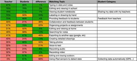
"Students show a high preference for data management"

"Text input and photos are most important among media types"

6 user flows

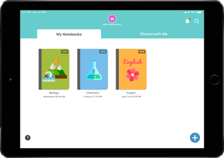
As the definition of the user crystalized our key use cases, design created user flows for the core uses of the app.

wireframe for the task notebook personalization
Wireframe "notebook personalization" task

User flows helped envision information architecture, organization and interaction design within the app, allowing for the team to begin visualizing how the user would navigate and complete tasks.

Research provided feedback from a user perspective performing preliminary cognitive walkthroughs, prompting the team discuss how each step leads to goal achievement.

7 ideation

Ideation moved the team into identifying concrete solutions to the challenges and needs we had collected along the way. Research focused on user data and findings while design pulled together design elements to further the team's inspiration.

Approaches & Inspiration
  • Inspiration gathered from existing apps, both direct, non-direct and inspirational competitors.
  • Collaborative group discussions built concepts and identified likes and dislikes of various approaches.
  • Crazy-eight session where each team member shared ideas for how different features and functionality would work using visuals.
  • The style-guide provided by the aquarium ensured our designs would be aligned with our client’s brand.
Images from the ideation exercises using existing app features and crazy-8's; notepad image and drawing of ideas.
Inspiration through existing app features and crazy-8's

8 wireframes

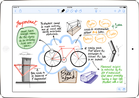
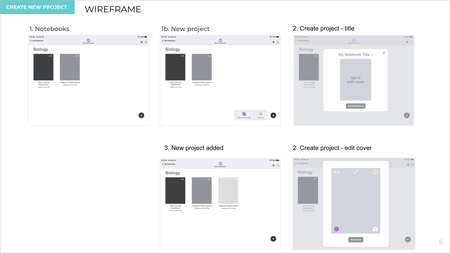
Wireframes were ultimately created with a focus on specific use cases that highlighted the capability and value of the app to the student. Specific steps were developed based upon the user flows created earlier.

ink notebook wireframes created by design
INK notebook wireframes created by design team

The entire team worked through various revisions as a result of design reviews and continued walkthroughs.

Wireframes / User flows
  • Add text
  • Take photos
  • Add sensor data
  • Add feedback
  • View feedback
  • Notebook personalization
  • Customize profile
  • Annotations
  • Search

9 prototype development

Design chose Figma in part due to its ability to support team collaboration and testing. The focus was on creating an easy to use UI that would support our target user as well as be consistent to our client's brand.

The team also thought about the familiarity of tools that our user may be already comfortable with, leaning on design conventions from tools that were part of our earlier research.

Final Prototype

Ink digital notebook prototype
INK digital notebook prototype

The entire team worked through various design revisions as a result of continued design evaluations and cognitive walkthroughs. This allowed research to begin framing usability testing protocols and defining what those studies would look like when performed.

Research supported Design with
  • Design revision feedback
  • Cognitive walkthroughs
  • Functional testing

"Leaning on familiarity, the team referenced design conventions from tools that were part of our earlier research"

10 usability testing

The team held two rounds of usability testing with a combination of students, teachers and staff members totaling 18 users.

Details
  • Rounds of Testing: 2
  • Participants: 9 students, 6 teachers and 3 MBA education staff
  • Method: in-person, moderated
  • Scenarios: task completion, qualitative feedback via think aloud, open ended and Likert scale questions.
  • Moderators: primarily research with support from design
  • Set Up: Figma mirror on iPad with overhead camera (iPhone)
  • Capture: iPad screen, hand gestures and audio, while taking notes on any behaviors experienced but not caught by the recording.

Our goal was to isolate usability issues early on to support at least a second round of usability testing in hopes to see the value of iteration having a positive impact on the quality of the app.

stock photo of a user on an ipad
Using on an iPad

10a usability testing - round 1

5 students and 4 teachers

Study Focus

As this was our initial testing session with users, our focus was broad and on general UI, layout and information architecture as well as key features.

Research Questions
UI and Design
  • Is the overall layout of the notebook easy to use for a first timer without instructions or training?
  • Do UI elements support recognition and ease of use?
  • Are the language and icons appropriate and understood by a variety of age ranges?

Information Architecture
  • Does the organization of the notebook support how users work in the real world?
  • Does the notebook provide a findable and usable navigation?

Features
  • Are users able to accomplish the tasks we outlined?

Test Scenarios

We developed our test scenarios to walk users through the main functions of the app as determined in the wireframes.

  • Organization/navigation: create a notebook, project, and sections
  • Content creation: text, sensor data, photos, annotations
  • Feedback: add and view feedback
  • Personalization: edit notebook cover and profile
  • Search: search everything
Findings
Positive
  • UI: students and teachers appreciated how clean the interface was and found the app easy to use and navigate.
  • Information architecture: students and teachers found the app’s organization of notebooks, projects, and sections useful and easy to understand.
  • Features: students and teachers enjoyed using personalization, feedback, search, and content creation tools.

Areas to Improve
  • UI: personalization menu icons and content creation toolbar
  • Findability: findability of text formatting menu and sensor data menu
  • Features: no app onboarding, no add/import file feature
“I like the notification. I already know that’s what it is.”
STUDENT
“I feel like if you’re done with it you shouldn’t have to go all the way back to the thing [icon].”
STUDENT

10b usability testing - round 2

6 students and 3 teachers

Study Focus

The design team made updates to the prototype based upon findings and recommendations from research to support a second round of usability testing.

The team ran A/B tests on a few features that we wanted more feedback around, in addition to usability tasks and walkthroughs similar to those we completed during round 1 testing.

Research Focus
Findability of Features
  • Are users able to find the features that we changed, including menus and icons

Expanded Functionality
  • Do the help overlays and introduction help first-time users understand how to use the app?
  • Does the pages sidebar function as users expect?

UI Updates
  • Are icon and design updates understandable to users?

Test Scenarios
  • Welcome: view tutorial, explore help features
  • Information architecture: add sections, add a page
  • Text formatting: version A / B
  • Collect data: top menu vs. keyboard menu
  • Comments: view a new comment
  • Personalization: test updated icons
Findings
What Worked Well
  • UI: test participants like the clean and simple aesthetic of the app.
  • Findability: people responded well to the updated menu locations and were able to find the text and data menus much more easily.
  • Personalization: Students and teachers commented on how much they loved being able to personalize covers.

Areas to Improve
  • UI: icons (pages sidebar, help overlay, add text); new comments were not obvious
  • Findability: personalization pencil tool menu; users preferred text formatting menu where options were laid out on keyboard
  • Features: help overlay and tutorial language was vague; interactivity between sections and pages

“Very straightforward. Oh, I like that you can personalize it. That has me psyched!”

STUDENT

PROJECT DELIVERABLES

Our final deliverables were designed with 2 goals in mind
  • Provide guidance to future development teams by leaving behind a detailed record of our design and how we got there.
  • Help our client obtain funding from donors.

Reference Links

With the hand off of our final deliverables, our client has the resources they need to pitch the app for funding and transfer our work to future development teams, with the potential to impact students and teachers worldwide.

ink notebook logo, orange octopus

my reflection

Working on this project was personally rewarding for me as I was able to connect with several of the findings and values that came out of our project's research. I have always used notebooks to take notes, draw pictures and capture ideas. As a life-long learner, I understand the value of reflection and the importance of being able to reference my previous work.

Supporting "organization" within the app was more than just being able to find previous notes though. The literature review highlighted that paper and digital notebooks were not being referenced, or reflected upon as often, believed mostly due to archiving standards not being followed by newer generations of scientists.

The impact to this is a lack of insight, as findings aren't pulled forward from previous research, not making potential connections that could be something much more. This worries scientists and researchers who are seeing this critical step not being utilized; something many believe is the key to deeper insight.

This was especially interesting to me as a researcher as I have thought about this challenge in my own work and how I make connections to my previous projects.

This project was a learning process for me in a few other ways. It was my first time developing something where the user was a student and the first time the context was education. I was honored to work on this project knowing the potential would be for students to discover their own passions using a tool that was built just for them on their journey of learning.

“As a life-long learner, I understand the value of reflection and the importance of being able to reference my previous work.”