ModCloth iOS App

Accessibility Cognitive Walkthrough

purpose

Emphasizing the need for inclusive design, our team was interested in the experience of users who relied on accessibility software while navigating the ModCloth iOS app.

Our team performed cognitive walkthroughs using screen reader software and documented the results to allow for a collective data analysis and reporting.

VIEW PDF REPORT
My Role
  • Research
  • Cognitive walkthrough
  • Data analysis
  • Design feedback and revisions

Team
  • John Molendyk
  • Robin Kang
  • Serena Epstein
  • Youngsun You

why this project

Users who are blind or visually impaired use mobile websites and apps to shop online. Many users rely on websites and apps to be developed to support accessibility, allowing screen reader software to read the page out loud to the user. However, many times navigational page elements are not coded to include the right tags, and websites and apps can be overly reliant on dynamic frameworks, without considering how screen readers will interpret the results.

When websites and apps are built without accessibility in mind, the results can leave users of screen readers without options. Ultimately, many users abandon their tasks as they feel asking others to help them robs them of their sense of independence and causes them to be a burden on others.

"I felt literally left out of society; the world, because I wasn't able to participate in normal things"
Joy Ross

who is ModCloth

Bringing vintage-inspired clothing and accessories since 2002, ModCloth is a large online retailer known for their commitment to inclusivity and customer engagement.

With a mobile-first strategy and iPhone and Android apps, mobile browsing accounts for over 50% ModCloth’s customer engagement.

ModCloth Website

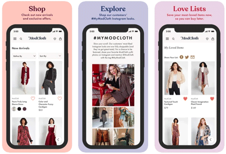
image of 3 iOS app views of the ModCloth app

what we did

A streamlined cognitive walkthrough examines a specific task, step-by-step with a target user in mind to determine the cognitive load a user will experience when completing tasks.

our process
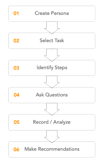
  1. Starting with creating a Persona, our team had a target user to consider.
  2. We selected a core task from within the app, one that represented a common task.
  3. We broke our task down to the step level
  4. We then asked two question of each step as we performed the task.
    • Will the user know what to do at this step?
    • If the user does the right thing, will they know that they did the right thing, and are making progress toward their goal?
  5. Record findings, analyze to determine successes and failures
  6. Determine the most appropriate recommendations for improvement with consideration to all users of the app
the process we used, 01 create persona, 02 select task, 03 identify steps, 04 ask questions, 05 record and analyze, 06 make recommendations.

selected task

A common task for the users of any app, including ModCloth would be searching or browsing products while filtering results for color, size and price.

user flow
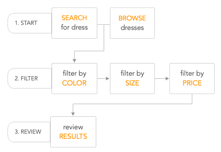
  • The task has two possible starting points
    • Search for a dress
    • Browse dresses
  • followed by these tasks in sequence
    • filter by Color
    • filter by Size
    • filter by Price
    • review Results
flowchart of the steps from the selected task

what we found

Findings

The cognitive walkthrough resulted in 12 findings, each with their own recommendations.

a few examples
  • Filter by color - Voiceover reads the filter icon on the header as "button" and not the label of "filter".
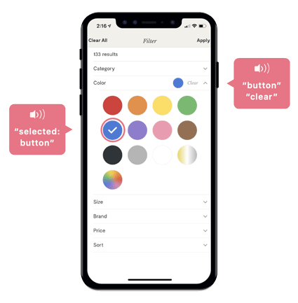
  • Filter by color - Inside the color menu, Voiceover reads each color icon as "button", not allowing Voiceover to identify the actual color for the user. (see image for detail)
  • Filter by price - The price filter uses a slider that Voiceover reads as "price $0 $600", and not control's useful label.
Recommendations

We identified recommendations to help correct the for the issues we encountered.

a few examples
  • Alt text and labels - using alt text and control labels allows screen readers to provide accurate content to the user.
  • Sliders - Avoid using sliders for option selection as they are usually inaccessible to screen readers and require precision, something that may be difficult for those with certain motor disabilities.

See the report for all findings and recommendations

VIEW PDF REPORT

ModCloth app image showing accessibility issues; screen reader states selected button, button clear

my reflection

Supporting accessibility within software was new for me, but the experience has highlighted for me the importance of inclusivity within the products I build.

As part of this project, I researched how blind and visually impaired users engage with screen reader software to navigate the web. I came across inspirational stories and learned about what technology meant in the life of a blind user, and specifically how using a mobile device brought new opportunities to simultaneously connect and experience independence.

One of those stories was from Joy Ross, a blind YouTuber who lost her sight in her 20s. On her channel, Joy shares her experiences using tech, and in the video clip included, Joy shares what it meant for her as she used her iPhone for the first time. Joy reflects on the moment sending that first text message, she remembers crying, going on to explain how her phone has helped her feel like a normal part of society and the world.

In her words, her phone has become her eyes, transforming her life and giving her back the freedom she once lost, all because she can participate in the things others are doing.

Earlier in the video Joy talks about her experience on a popular social media site. In one experience, a feature allowing her to see engagement from her followers changed, and apparently leaving her screen reader without the ability to read "likes", and Joy without the ability to get feedback from her followers; an obvious source of connection for her.

Joy Ross YouTube video, this is how I read, write and use my iPhone.
"My iPhone has been my eyes for me, it has changed my life; I can be a normal person and function in society"
Joy Ross

resources